
Cram App Redesign Concept
- pettyabigayle

- Nov 15, 2021
- 2 min read
Updated: Nov 18, 2021

Overview
In this project, I was tasked with redesigning the interface for a study app, Cram. Cram is an app that you can use to create virtual flashcard sets and has an algorithm that allows you to study based on what cards you have mastered or not. It has modes that allow you to look at the card set, memorize, and "cram".
The Problem
Looking at this app, there wasn't anything necessarily "wrong" with it. However, aesthetically, it wasn't great. There was a lot going on with bold colors and it made it feel very heavy. Looking at their the Cram website, this problem was nonexistent. It was light, bright, and felt very inviting.


The Process
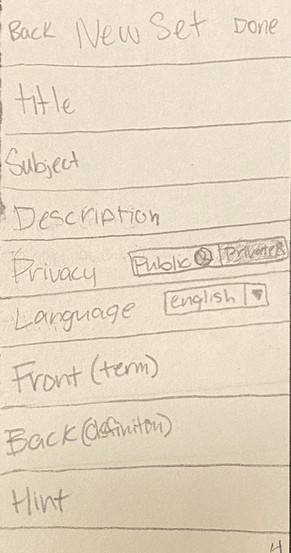
I started with sketching my ideas for a new app layout. It was quite similar to the layout that previously existed but with some changes here and there. Mainly, I redesigned the home page, sign in page, and new set page. Something I noticed was that the "bones" were pretty good but the way the app worked had issues. It's a very useful app, it was just designed in such a way that made me not want to use it.




Next I moved onto creating wireframes in Figma. Keeping the graphics simple and using a wireframe UI kit, I created basic wireframes that layed out my app redesign.


This is the style guide I created for my final design including the text styles, colors, and gradients I used. I think that the simplicity of the typography helps to make it clean and simple and the colors of the app help to make it cohesive with the branding of the company and website.

I also created the icons used throughout the different screens. I decided to continue with the gradient theme so that everything felt unified. This also made them more visible.

Final Design
After studying other flashcard apps, I created my final design. For this design, I redesigned the color scheme of the app and created a cleaner, brighter look for this app. I feel that it's functionality works better for a study app and helps create an app that people would want to use for something they resent as much as studying for tests.







Here's a full run through of my redesign!
Reflection
This was a really great project to do. I enjoyed being able to focus solely on the UI side of an app. Not having to worry as much about user experience allowed me to have a lot more freedom as far as design. Also, because this app already exists and works, it allowed me to focus less on how it works and more just on what it looked like. I believe my design was effective because of the simplistic nature of it. I think that the graphics are more incorporated into the design and the colors actually have a purpose. My design gave this app the facelift it so desperately needed. I'm very happy with the way my redesign worked out and it showed me that not everything has to be a huge change but that even little changes make big impacts.

Comments